CANDIDATE: Sonia Aguado
SCHOOL: Poole High School Sixth Form
CANDIDATE NUMBER: 6002
CENTRE NUMBER: 552277
TO VIEW IMAGES MORE CLEARLY, CLICK ON THE IMAGE. CLICK THE BACK ARROW TO GET BACK ON TO THE BLOG.
WHEN YOU REACH THE END OF THE BLOG, CLICK OLDER POSTS TO SEE THE REST.
Tuesday, 26 January 2010
Monday, 25 January 2010


Sunday, 24 January 2010

Saturday, 23 January 2010

Friday, 22 January 2010

Thursday, 21 January 2010
Existing media.
In order to ensure I followed the codes and conventions of a real music magazine, it was important to purchase other existing products and analyse what makes them successful and which aspects I would have to include within my media product. I decided to focus on NME magazine as this is the magazine on the current market which I would like my product to resemble and also Vogue as although it is a fashion magazine as opposed to a music one, it will allow me to pick up certain codes and conventions which are typical of magazines in general.
My main inspiration- NME front cover.

In order to effectively challenge and develop codes and conventions of a magazine when creating my own front cover, I will need to identify these codes and conventions through analysing existing music magazines on the current market. I have chosen NME as the main inspiration for my own music magazine as it is a well-esatblished, up-to-date magazine which has a similar target audience to mine. It is one of the best-selling music magazines in the UK, therefore it will be ideal in helping me follow the codes and conventions needed for a magazine of this genre.
This magazine front cover clearly has certain codes and conventions that it follows. It has a logo in the typical place of the top left hand corner, the logo will also be the same throughout every issue in order for potential or loyal customers to clearly identify that it is the magazine they are looking for. The logo is also capitalised which shows it is a prestigious magazine, it makes it shout out to the audience and it can also symbolise the fact that the title is in fact abbreviated. I will need to take this into account when designing my own logo.
The first thing that will attract a browsing customer (as opposed to a loyal reader who won't be necessarily influenced by the front cover alone) is the main image. This is a huge selling point to a magazine as this is immediately where a customers focus will be held. The artist(s) used on the front cover of a magazine have to be easily recognisable and established as this will portray the message that this magazine is worth reading and it focuses on real, successful musicians. Both of the artists on the front cover have a direct mode of address as they are staring into the camera lens and having 'eye contact' with the audience. It is as if they are urging you to pruchase the magazine and read about them. The picture is a mid-shot of the two artists which follows the typical codes and conventions of a magazine front cover and this will encourage me to use a similar shot as I don't feel I can challenge this particular convention. As both the artists are in similar attire this clarifies the fact that they are in a band and it suggests unity between them. As their outfits are simple and black it shifts the focus to their faces and makes the colour scheme stand out considerably.
On this particular issue the colour scheme is striking yet simplistic. The colours used are red, white, black and a small splash of yellow. This is a typical code and convention of a magazine and it is both complimentry and attractive to the reader. This colour scheme in particular corresponds with the colour scheme of the 'NME' logo which is clearly identifiable in every issue. If too many colours were used on the front cover of a magazine it wouldn't appear as chic and proffessional as it would be challenging the codes and conventions of a magazine. It may also take focus away from the main image.
Another thing that becomes apparent to me when analysing this front cover is that the font used is basic and used throughout the cover with little variation, occasionally using itallics for quotes etc. The fact that it is a simple font makes it easy to read and will not cause confusion between words when being read. This also makes the front cover seem consistant which could reflect that the content of the magazine will also be consistant throughout. All headings are capitalised which instantly draws the eyes to these particular points and puts focus on certain names etc with different use of colouring. It is as if it is directing the reader to which articles to read first.
All the strap lines used which are irrelevant to the actual band shown on the front cover are placed to the side of them whereas their actual band name and information introducing them and the article about the is placed directly over their photo. This is so both image and written text relate to eachother directly. Although this may seem obvious it needs to be followed through as it wouldn't feasible if other text was splashed on top of the main image. It shows the magazine has order and it will direct you, not confuse you.
I will need to take all these ideas into account when designing my own magazine front cover in order to establish that all the correct codes and conventions are followed. This will give me the opportunity to also challenge and develop existing media.
Wednesday, 20 January 2010
Analysis of Vogue front cover

To further my analysis and in order to make sure I have a clear understanding of codes and conventions of a magazine front cover, I decided to look at a high end fashion magazine. In doing this, I will be able to determine a clear understanding of codes and conventions of all magazine front covers as opposed to just sticking to music magazines. This will give me a broader spectrum of what to include and it will allow me to maybe introduce some new ideas and challenge aspects of a music magazine front cover with those from a fashion magazine.
Similarly to the NME magazine front cover, this magazine includes its logo on the top of the magazine. The difference is it goes from left to right and covers the whole top of the magazine as opposed to being placed in the left hand corner. This suggests the magazine has power as it is dominating the front cover. It suggests that it leads rather than follows which is very relevant to the fashion world. To someone browsing through a shelf of magazines, they aren't going to be able to miss this striking heading as it will stick out of the top of other magazines if it was placed behind a different one on the shelf. The font is quite simple and sticks to one colour only-white. This automatically brings connotations of purity and cleanliness and this may reflect the content of the magazine. Although the positioning of the logo is very effective on this particular issue, I don't feel it will be suitable for a music magazine as a music magazine is dominated by music and that is what sells the magazine whereas in the fashion world it is all about identifying and setting the latest trends or designers and this particular publishment has a reputation of being the leading fashion magazine around the world. The name is what sells the magazine as opposed to anything else.
Similarly to NME magazine, the strap lines are positioned around the main image and only slightly covering the actresses body, not covering her torso or face at all. This is as, once again, the focus is on the actress and the first thing the audience is going to identify. The colour scheme is considerably different to the NME colour scheme. Vogue uses prodominantly monochrome colours. This could be due to the fact that it is known, in regard to fashion, that black and white go with anything and can be worn anywhere to any occasion. The only other colour used is on the main headline 'THE SHAPE ISSUE'. This is highlighted with the colour orange and makes the headling clearly identifiable. The fact that this is the only headline which is coloured suggests this is the main story within the magazine and it sets the tone for this particular issue. The audience will get an insight into what to expect from the magazine before they've even read it and seeing as this is a topic most women talk about everyday, they are likely to buy into it. This inspres me to do something similar on my magazine front cover. The only other text on the front of the magazine which stands out as it considerably larger is 'Drew Barrymore' which is the name of the actress on the front of the magazine. It is important, as the cover star, to have her name clearly recognisable.
The image used on the front cover of the magazine is a long shot. This is not a typical code and convention of a magazine and it may not be something I carry out when designing my own magazine, this particular magazine can afford to take some risks as it a well-established, iconic magazine. As this is a fashion magazine the focus may be on the long gown that she is wearing as opposed to on a music magazine, the focus is on the music and so they will use a mid shot to show the musicians recognisable face. Also, the set is more detailed than that of NME magazine as I have noticed NME mostly uses a plain, white background. Once again, this puts emphasise on the artist as opposed to clothing or background. Similarly to NME, the actress on the front of the magazine has a direct mode of address which, again, draws the audience into the image and making them want to read on.
A code and convention I have noticed that is typical of a magazine front cover is that the same font is continually used throughout it. It is a simple font which isn't going to draw attention away form the main image and as the logo is in a different font, it puts the right amount of focus on the magazine name before the strap lines. This gives the front cover a proffessional look as opposed to looking messy and rushed. It suggests time and attention has gone into creating this simple look with contrast to more detailed main image.
Although the front cover of the magazine is quite different to the cover of NME, it has been helpful as it has allowed me to distinguish the codes of conventions of a magzine but it has also allowed me to identify which aspects are more appropriate for a music magazine.
Tuesday, 19 January 2010
NME Contents page- inspiration.
 As I looked at NME's front cover, I decided I would continue to look at their contents page as well. I wanted to see what features may continue from the front cover on to the contents page and what layout will be used. This may inspire me with the creation of my own contents page and it will allow me to discover the codes and conventions of a music magazine contents page.
When looking at the NME contents page for the first time, it appears that there is a lot going and a lot for the reader to take in. This could be to emphasise the fact that there is going to be a lot of content within the magazine which will engage the reader and there will be something for everyone. A predominant feature on this contents page is the NME logo in the banner along the top. This has to be an eye-catching feature as although it is obvious to the audience what magazine they're reading, it is repeatedly used in order to build a relationship with the reader and makes the logo well known, iconic and identifiable. Beside the logo it says 'THIS WEEK' in a large, capitalised font. This immediately tells the audience that this is a contents page and that they will be lead to certain articles within the magazine.
The colour scheme is green and white with splashes of yellow and red or the 'NME colours'. Again, the use of one or two colours makes the page look organised and easy to follow although the layout isn't necarsarily using such an organised style. The use of red in the bottom right hand corner is establishing the fact that it is 'NME' magazine as it is the same colour as the logo and although each issue may follow a slightly different colour scheme, the use of red will be familiar to the reader and it may seem as a comfort to them, especially regular readers.
There is a long column along the right hand side of the page with headings and page numbers with a small bit of descrpition. This layout is a typical code and convention of a music magazine and is a format that I will go on to use on my own contents page. The purpose of a contents page is to make it simple and easy to follow for the audience and I think this purpose is achieved effectively as it is giving the reader direction. The column is split into sections by sub-headings, this allows the reader to identify what sort of thing they are looking to read whether it is a story on the front cover or whether they want album reviews. The page numbers are in the colour red which links it back to the NME logo which gives the reader a sense of consistency as this will be featured in each issue no matter what colour scheme is used. Another aspect of the contents page, which is using the same technique by using the colour red is an arrow with text in it pointing to the right of the magazine. This persuades the reader to turn the page and encourages further reading of the magazine. I think this is an effective technique as the contents page is the first page of the magazine that the audience will look at and it needs to be able to prompt readers to turn the page as well as giving direction and a guide to the magazine.
The central feature of the contents page suggests this is the first issue of a new year as it says 'ALBUMS OF 2009' it then goes on to say 'EVERYTHING YOU NEED TO HEAR THIS YEAR'. This makes the reader believe they are getting first exposure to new bands and newly released albums and they will believe they will be the first ones to experience this. This is a good technique to use as this furthers the readers need to continue to read the magazine as they wouldn't want to miss out on any new releases or talent. The images below the headings gives the reader an insight into what to expect from this particular issue or future issues and they could identify certain bands they are a fan of and immediately want to read about them. The fact that images of the bands alone weren't used and they instead used pictures of double page spreads will make it recognisable to readers that this is actually within the magazine.
Monday, 18 January 2010
Research- Vogue contents page
 To further my research I decided to look at the contents page from an issue of Vogue magazine for more inspiration and to get new ideas which could possibly be included in my magazine contents.
Straight away you can see how the whole layout of this contents page in comparison to NME' s contents page is totally different. It's alot more simplistic and not as busy or colourful. The font used is very basic and there isn't any particularly large fonts used, the focus is more on images. A similarity between the two content pages is that a bold heading is used followed by normal writing on each point suggesting this is a typical code and convention of a magazine regardless of it being either a music magazine or a fashion magazine.
Not only is there text along with page numbers but also images which makes it easy to follow and perhaps attracts readers to go to that page straight away rather than reading through all the text to get to the page they desire. This could be something which I can include in my contents page.
All the seperate pages are split into sub- categories: 'features', 'fashion' and in 'every issue'. You also see this in NME which again makes me take into account that this is an aspect I should definately include within my contents page.
Sunday, 17 January 2010
Analysis of NME double page spread.
.jpg)
.jpg)
As I have followed the same style as NME, before going ahead with the plan of my double page spread I decided to analyse one of NME's double page spreads for some inspiration.
On the left hand side of the spread is a large picture of the band the spread features. The whole band is included within the shot but one member is standing out prodiminantly and makes you presume he is the lead singer. The main focus on the image allows the audience to establish who the band is visually but also allows them to not be overwhelmed by the amount of writing. The text and the images being separated presents a neatness to the page and it appears inviting.
The page on the right hand side is the main heading which largely presents the band name. This attracts the reader first and along with the main image is attractive to any reader who is a fan of this band and prompts them to read on. Beneath the main heading is a sub heading which nicely introduces the main article. A noticable code and convention of a double page spread is to have a large, bold letter at the beginning of the main text. This allows the reader to identify exactly where to start reading and is also attractive visually rather than chunks of text in the same size and font.
There is a small image in the bottom, right hand corner which once again, breaks up the masses of text and also is visually pleasing. Along with the image is a quote from the band in the spread and this is something that could draw a reader into reading an article, especially if it is an intruiging or funny quote. These are all points I will take into consideration when planning and completing my double page spread.
Analysis of Vogue double page spread

This double page spread has a lot more focus on the image used as opposed to text and the content of the article. This could greatly relate to the fact that this is in fact a fashion magazine and images are very important in showing clothing the article reffers to.
Saturday, 16 January 2010
Logo

In reference to the front cover of a magazine, the logo is a very important thing you need to consider. I decided to look at other established magazines logos in order to get an idea of which fonts and colour schemes are used in order to make sure I too use a font which fits into usual codes and conventions of a magazine.
The first logo I decided to analyse was the NME logo as that is the magazine I am most inspired by and the magazine most of my target audience relates to and would chose. The red, white and black colour scheme is used on every issue of the magazine and is what most of the magazines colour schemes revolve around. The lettering is bold, yet simple. This wouldn't take away any focus from any other aspects from the magazine front cover itself but the colours used allow it to stand out in its own right. The lettering is very much presented in a block like way as opposed to a more 'bubble' shape. This represents the fact that the magazine is solid- it has solid views on music and it is stable, it's not going to let you down as it is reliable.

The Q magazine logo is similar to NME's logo due to the colour scheme. This seems to be a popular choice for magazine logo's of this type so I am less likely to do something similar as I would want my magazine to stand out, not copy. To be individual. This will back up the indie genre of my magazine. The Q logo doesnt use black lines to outline the lettering like NME does. This doesn't create such hard imagery as NME and makes the reader feel this may be a more mellow magazine to read. The lettering used is also not as harsh and block like as NME and therefore it might appeal to a slightly different audience.

The Kerrang logo is different to the previous logo's I have looked at. This suggests either a totally different audience or genre of music. This could also suggest rebellion, refusing to conform to the codes and conventions of the simpler, red and white logo's. They want to offer their audience something different and that they have strong opinions of their own. The use of punctuation on this logo is also different to the other logo's I have looked at. This added feature may excite the audience and suggest to them they will be entertained when reading this magazine. This logo only includes the colours black and white. This could represent how the magazine could be taking things back to basics and they won't include any unnesarcary fuss in their articles.
Friday, 15 January 2010
Development of my logo
Before choosing the final logo for the front cover of my magazine I decided to chose some of my potential logos I found off the website http://www.dafont.com/. I will be looking at them and discussing what makes the logo suitable for my magazine front cover and also why it may not be the perfect choice.
 This is the first logo I found. On first looking at it there are a lot of positive things I can say about it and why I think it would be effective to my front cover.
After analysing the logo's of NME and Q etc I feel this logo is different to other logo's on the current market, therefore it is memberable compared to just a simple font used like the other magazine logo's, this is detailed and and is visually appealing. It is also individual- it stands out from the rest. This corresponds with the feel I want readers to get from my magazine- it is individual and different to others. This further backs up the 'indie' image of my magazine as the term 'indie' comes from 'individual'. This font is actually called 'ringmaster' and this and the way it actually looks gives connotations of a circus suggesting my magazine is going to be similarly fun, wild and entertaining which is definitely a view I would want my target audience to have about my magazine.
Although there are a lot of positive points to this logo, I also need to look at the negative side and why it may not be the best logo to use for my magazine front cover.
Although I saw the heavy detailing of the font to be a positive thing, for the front of a magazine it may be too 'busy' and draw attention away from other images or text on the magazine front cover. Despite the fact this logo has all the right connotations I want to be associated with my magazine, I feel it doesn't fit in with the genre of my magazine as it is based around Indie music and I feel that this type of font may be linked with a more pop, upbeat genre. After analysing other magazine logo's, I have come to the conclusion that this logo doesn't follow the typical codes and conventions of a magazine as I haven't come across any other logo with this exccesive detail. Overall, I don't think this logo is right for my magazine.

On a first glance this logo seems very relevant to the type of magazine I will be creating but once again I need to weigh up the positives and the negatives. Aspects of this logo such as the skulls used would successful follow the theme of my magazine as these symbols often represent the indie genre. With the bold outline of the actual lettering but the softer pattern around it makes it different to other magazine logos which I have analysed. This will result to the logo standing out from other current magazines on the market and it may also suggest that this magazine can offer something different to its readers and that it knows exactly what you want. This logo is also very artistic and this brings connotations of artists which can be directly related to musicians. It suggest that if you purchase this magazine you will be reading about artistic and talented people, as opposed to being a basic font, which may mean that there is something new for discovery.
Although there are many positives to using this particular font and it is different to other magazine logo's, after analysing other logos it doesn't follow the typical codes and conventions of a magazine. This may seen as ambitious for the first edition of a new magazine and may not be accepted as established. Another negative point is that the actual lettering may not be bold enough and it may not be obvious as to what the magazine is called but on the other hand, as it includes heavy detailing it may draw too much attention away from the main image and may make the front cover seem cluttered and unproffessional.
 I next decided on a more basic design for my logo. This particular style has many aspects which appeal to me for my logo. The lettering is very clear and it makes the name of the magazine very obvious. There is no fussy detailing and gets straight to the point. This may appeal to my target audience as it suggests that the magazine too is straight to the point and honest. It fulfills its intended purpose effectively and it gives off the impression that it is reliable and not unfamiliar. It also follows the typical codes and conventions of a magazine logo as it is basic, bold and simplistic which I have discovered when studying other magazine logos. Although it is a basic design, I still feel it is attractive to look at.
After I carried out my research of other magazine logos, I feel this logo is too similar to other music magazines on the current market and may confuse potential costumers. This also contradicts the message I want my magazine to portray, this logo does not represent indivuduality if it is similar to other logos. This doesn't follow the idea of my magazine being aimed at indie people or indie music as, as mentioned earlier, the word indie originates from the term individual. I also feel this design is too basic and won't prokove feelings of excitement in potential costumers.
 This is the logo that I decided was best for the front cover of my magazine, it is clearly distinct from other magazine logos I have previously looked at. This would also make it very obvious to the audience which magazine they will purchasing and there wouldn't be the confusion which I discovered may occur with the previous logo.
With the 'cracked glass' effect of the logo, this brings connotations rebellion, individuality and 'breaking the rules'. This will appeal to my target audience as they don't want to invest in something that is going to be the same as what everyone else is buying into. They want to be different and they don't want to follow the rules, they make their own rules. This logo can be symbolic from them breaking free from the guidlines society expects them to follow. This also corresponds with the genre of the magazine as these are beliefs that 'indie' people would follow.
Although this magazine logo is significantly different to other magazine logos I have looked at, I don't feel it challenges the typical codes and conventions of a magazine logo too much. It isn't too ambitious for the first edition of a magazine and I feel the target audience would appreciate the fact it is very slightly challenging the codes and conventions and buy into it.
The font of the logo is simple but the slight 'cracked' detailing makes it eye-catching but not so much that it takes attention from the main images or other sub-headings. The simple use of black and white colouring means this logo will effectively match any other colour schemes which may be used in other issues. If I used a light background in another issue, I would simply change the colours to be a black font on a white background as opposed to the white on black as it currently is.
All of the above logos could have been used and would have had points which could be argued to be suitable to for the logo of my magazine but I do feel I have used the best logo for my final product and after weighing up other magazine logos as well, I feel it caters for a gap in the market but not so much so it will be rejected as un-realistic.
Thursday, 14 January 2010
Target audience.
Before I started to create my magazine I had to select my target audience as that would be the most important factor to bear in mind whilst putting together everything from the type of music my magazine would be based around, to layout and images used. I have decided my target audience would be both male and females between the ages of 16 to 25. This is a broad audience so I will need to make sure I include plenty of things to cater for all audiences within this spectrum. The design as well as the conetent will decide who will purchase my magazine. I will also hope that people within my target audience aren't the onlyones to purchase my magazine, but people who are interested in certain factors of my magazine.
In order to get the right idea as to who my magazine will be directed at I need to take into account the type of interest my target audience will have, what their attitudes and values are and even factors such as where they shop. I feel the people who my magazine is aimed at will be greatly creative and have a strong interest in music. They may be finishing school, still attend college or sixth form or even be starting out at university or in full time employment. Although there are these differences between what they do in their time, they will have certain aspects in common.
In order to get the right idea as to who my magazine will be directed at I need to take into account the type of interest my target audience will have, what their attitudes and values are and even factors such as where they shop. I feel the people who my magazine is aimed at will be greatly creative and have a strong interest in music. They may be finishing school, still attend college or sixth form or even be starting out at university or in full time employment. Although there are these differences between what they do in their time, they will have certain aspects in common.
 To the target audience of my magazine, image is important to them. They want to reflect their individuality through the clothing they wear and the way its put together. People will be able to identify them as being interested in certain music etc through this. The places I feel they would shop in order to create this identity for themselves is places such as Topshop or Topman.
Other stores which my target audience would shop at are charity shops such as Oxfam. This is due to them wanting to feel indivdual and being able to walk into a charity shop and buy clothing allows you to find unique, one off peices that aren't as accessible as shopping in a high street store. Something else that they would enjoy is being creative and customising clothes to make it up to date and to reflect themselves. Vintage clothing would also be a reason for shopping in these stores and this could be to reflect a particular era of music they are interested in. Markets such as London's Camden Town market would also be a place where my target audience would be interested in purchasing clothing to create their identity.
Sunday, 15 March 2009
Potential image for front cover 1
For the image on the front of magazine I decided to feature the lead singer of the band mentioned on the front of the magazine. These are the photos and edited photos which I could have potentially used.
This first image puts emphasise on the lead singer as opposed to the whole band as I wanted to include a single person on the front cover of my magazine as that is a common code and convention of a magazine front cover. The shot here is a close up which puts full focus on the artists face. This is in order to allow him to be fully recongnisable to audiences and they will identify him with the band name on the front of the magazine. The fact he is wearing sunglasses still gives the shot a bit of mystique as people who aren't fully familiarised with the band may be intruiged as to who this is. The iconography within this picture such as his checked shirt relates to the target audience who will take an interest within my magazine/this band. The store TOPMAN is a popular place to stock these type of shirts and this will make the audience identify this artist and perhaps aspire to be like him by purchasing similar clothing.


I decided a plain, white background would have been best to use for this particular image as it is a typical code and convention of a magazine to include a plain background as there will also be other text included on the front cover. I decided to use photoshop to acheive this. As I am not too familiar with this program, I don't feel this image looks proffessional enough to use on my front cover. The fact that it is a close up of his face also suggests that it may not be suitable to use on my front cover as, typically, a mid or long shot is used.
Potential image for front cover 2
This is another image which I would potentially use on my magazine front cover. The shot is taken at a slight lower angle which may represent the status this particular artist has in the music industry. It may suggest that he is prestigious and well respected as the audience is seen to look up at him which brings connotations of authority. Aspects of the photo such as his tattoo being on show and the 'geek glasses' he is wearing are greatly indentified as fitting in with the 'indie' genre and may confirm to the audience that this is the type of magazine they are reading. Male members of the audience may have a similar sense of style and feel they belong to this magazine.


Again, I decided to put this image on a plain, white background in order to keep the focus on the actual artist and to make it appear clean cut and proffessional. I didn't decide to use this particular image as I feel it challenges the codes and conventions of a magazine a little too much, especially for the first issue of a magazine.
Images for front cover3
This is another image I took and thought may be suitable for my front cover image. It is a mid-shot of the artist which is more of a code and convention of a magazine front cover, therefore it would be a more successful image to use. Iconography such as the bottle of beer the model is holding suggests going out and having a good time. This will make the audience relate having a good time with the band featured or they will relate it to the magazine. If they read it, it will show them how to have a good time or introduce them to music which will make their nights, nights to remember.


Using a location shot for certain images may be effective but I feel this certain shot wouldn't reflect the 'rock and roll' lifestyle of going out and partying that I want to portray. Little aspects of the photo such as seeing the radiator behind the home like leather chair. Again, using Photoshop, I decided to make the background colour plain and white. It makes the colours of the artists clothing etc stand out.


Using a location shot for certain images may be effective but I feel this certain shot wouldn't reflect the 'rock and roll' lifestyle of going out and partying that I want to portray. Little aspects of the photo such as seeing the radiator behind the home like leather chair. Again, using Photoshop, I decided to make the background colour plain and white. It makes the colours of the artists clothing etc stand out.
Front cover image4
This image is again focused soley on the lead of the band and being a mid shot, it follows the codes and conventions of a magazine front cover. Again, the clothing the artist is wearing clearly fits into the genre of the magazine. This may not be suitable for a front cover image as the artist is wearing sunglasses and people who aren't familiar with the band may not be able to identify who this is.


I decided to put a white background as although I liked the idea of a location shot outside, as it reflects a laid back feel, this would be particularly suitable for a summer issue of the magazine, I decided I wanted to relate this band and this particular issue of the magazine with the party scene and having fun. Also, there appears to be elderly people in the background of this shot which certainly would'nt project this.
Images, front cover5

This picture was a lot closer to the type of image I felt would be effective to use on my front cover. It is a mid shot of the artist which follows the typical codes and conventions of a magazine. I decided I would leave this image as a location shot and not alter it on Photoshop as it made it clear that this was a shot taken whilst out partying. Again, I made sure the models clothing corresponded with the genre of the magazine e.g the geek glasses, the hat etc.
I didn't want the artist to look directly into the camera as I wanted him to appear engrossed in having a good night and create and atmosphere in which the audience could get involved in- they feel as though they are getting a sneak peak into his lifestyle. I also didn't have the model with a toothy grin as this is a less obvious way of showing he is enjoying himself.
Iconography such as the drink in his hand clarifies the fact he is out in a club or a party.
The reason I didn't use this particular image is although I wanted a location shot, I feel in this particular shot the people in the background could be distracting and they it doesn't appear proffessional in some ways. Also, the artist appears a little shorter than people in the background due to a slight angle but I wanted to make the audience think he is someone to look up to and seem powerful and successful and I don't think that message comes across too well here.
Potential image for front cover REAL
I decided to use this image as my front as this reflects the party scene I wanted to have on my front cover. This is clarified by the bottle of alcohol in the models hand. The added iconography of the paint on his face makes the artist look like he's having a good time and he isn't afraid to rebel and get a little messy. That could be linked to the audience being interested in festivals and wanting to go there to get a little bit dirty and sacrifice cleanliness for their dedication to music. I liked the idea of the model not having a direct mode of address like the previous picture as once again, this creates and atmosphere of being totally engrossed in the moment and music. Being pictured in a club or party also makes it obvious that the artist is out, surrounded in music as that is a key aspect in the individuals life as opposed to being in a studio somewhere- he's out there experiencing  the music scene. The hand gesture the artist is making is also related to 'rock and roll' and that lifestyle/music. Using an in-direct mode of address is also slightly challenging the codes and conventions I have analysed on other magazine front covers and this may appeal to the audience as it is slightly rebellious and it may suggest my music magazine has something different to offer.
 the music scene. The hand gesture the artist is making is also related to 'rock and roll' and that lifestyle/music. Using an in-direct mode of address is also slightly challenging the codes and conventions I have analysed on other magazine front covers and this may appeal to the audience as it is slightly rebellious and it may suggest my music magazine has something different to offer.
Saturday, 14 March 2009
Analysis and development of my front cover.

To get my basic design idea I studied the layout of other magazines and looked at the traditional conventions and where they typically position various aspects on the magazine such as the strapline, main image etc. I decided to add a strapline to my front cover as I noticed most magazines included this and it was an important convention that would need to be followed.
Stereotypically, the logo of a magazine is placed at the top left hand corner of the magazine and I decided not to challenge this when positioning my magazine as it is ambitious for a first issue and it is easy to follow, recognisable for potential audiences and it works well.
I only want to use one large image on my front cover as when looking at other magazines for inspiration, I feel this is the kind of layout which stands out more as it focuses on one particular artist instead of being busy and crowded with several bands/artists. It also makes the front cover look sleek and professional and follows the conventions of a typical magazine cover. I am also going to use a small image on the bottom left hand corner introducing the artist which will be featured in my double page spread along with some text to give an insight into what the interview or article will be about.
The main headline will be introducing the main image and making it clear to the audience who the artist/band are if they are not aware already and could hail to existing fans as not only the face, but the band name will be clearly recognisable.
I will also be using a smaller image in the bottom left hand corner along with some text giving some sort of insight as to what is going to be one of the main attraction points of the magazine.
At the top left hand corner just underneath the logo is another small text box. This will also include something to attract readers to purchase, open and then read what is in the magazine, perhaps details of a competition. There will also be a small line of text at the bottom of the magazine.
 This was the first draft of my music magazine cover. From analysing examples such as NME. I have come to some conclusions as to how to create my magazine.
Firstly , the colour scheme is red,yellow ,white and black , this matches the scheme of NME magazine and works well because the colours are complementary whilst standing out amongst other magazines on the shelf. The colours are effective as they can appeal to both genders.
Across the top of the magazine is a strapline which is included on the cover of most magazines. It announces what could be of ineterest to a potential buyer and hail them to the magazine. I chose white font on top of red as this is striking and immediately capturing attention.
Coventionally, the magazine name and logo are placed in the top left corner of magazines. This theme makes it easier to establish what the magazine it is and I decided not to challenge this convention as it works well in all existing magazines. The reason for choosing this logo is because it has a smashed glass effect which gives conotations of rebellion whilst having a modern feel. Underneath the logo I have included what the title of the magazine actually stands for e.g NME stands for New Music Express. This makes it clear for any new readers to identify what it stands for and to avoid confusion.
Beneath the logo I have a cover stating a competition within the magazine. This too can attract readers and give them the opportunity to gain more from the magazine and has the potential to entice new readers who may not ordinarily purchase a magazine but will do with the promise of gaining some rare merchandise. I decided to challenge the usual layout of having straplines running horizontally across the magazine and instead had them in different angles. This can catch the eye straight away as it is positioned differently to the rest of the magazine. The fact that the text is written over a block of colour also makes it striking more than some of the less appealing text.
My main headline is the most enticing text on the page. This is because it corresponds with main image of the artist. I decided to continue to use the colour scheme of red and white but for the actual artist's name I used a completely different colour as this needs to stand out and be the main feature of the front cover. This, along with the image is going to be one of the most appealing aspects of the magazine so it important to make sure the focus isn't taken away from that.
Again, the barcode is in a traditional position of the bottom right corner. This creates familiarity which gives the magazine a professional look. Likewise with the date, issue number and price being placed together.
I didn't want to use too much text on the front of the magazine as this can take away focus of the main image and create a busy, non-professional look. The idea of having alot of text could 'put off' a potential buyer as it can seem somewhat overwhelming and rather having to read to be attracted to it, it's visually attractive. With having so much competition on the current market, the magazine needs to stand out and be appealing to the target audience especially if a potential buyer doesn't really have any 'browsing' time. It is important that the text actually included is simple, but is able to draw you in. I included straplines in the bottom right hand corner of te page as well as along the bottom of the page as it isn't distracting attention away from the main focus of the magazine and they are in traditional posisitons of a magazine front cover.
 I decided I wanted to change the main image on the front cover, as my double page spread is focused on a female solo artist and the previous picture used was of a solo female aswell. To replace this, I decided to use the lead singer of a male band as this could reach out to a wider audience. Men can identify more with a male figure on the front cover and can be drawn to that fact as they may aspire to be like him. Women may look up to this male as someone they would want to be with and also as a strong male icon. I needed to make sure my magazine could appeal to a both male and female audience by not only focusing on one of the sexes.
The main image is fun and striking and also compliments the colour scheme which is important. The main headline also corresponds with the main image as it is about the artists band and along with the image and headline, fans are able to recognise the name of the band alongside the lead vocalist.

Wednesday, 4 March 2009


Tuesday, 3 March 2009
Analysis and development of my contents page.
 After analysing other magazine contents pages, I decided to follow a rather simple, yet effective layout such as NME's. Although Vogue's contents page looks proffesional, the layout used is more recognisable with a fashion magazine and I personally felt more drawn to and inspired with NME's layout.
I decided to include a banner across the top of the page making it clear that it is the contents page for that actual issue. It is the first thing that will attract the reader so it will have to be large and striking.
I am also going to use a picture taking up the middle half of the page. This will correspond with the main artist on the front and also be eye-catching. Rather than being over whelmed with a block of writing, a picture helps excite the page and also gives the reader a visual to help them get to the correct page they want to go to. Beneath the picture I will have a small bit of text, reflecting the picture just to give a quick bite of information for the reader to engage in. Beneath that paragragh of text, I will have another little bit of text and perhaps a picture advertising or possibly promoting something else within the magazine. This will also stop the risk of having excesses of writing.
Along the right hand side of the contents page, I will have a column and that will be where the reader can directly access the exact page numbers of the page they desire to turn to. Having the contents in a comlumn layout is a typical convention of a magazine and is an easy and typical layout to follow.
.JPG) After planning the rough layout of my contents page I started to peice it together. In the banner across the front of the page I decided to use a bold font in black saying 'THIS WEEK' with the month beneath it. This allows the to reader clearly identify the purpose of this page. I used purple as it is an attractive colour, but won't distract the reader's attention from the actual image. 'January 2009' is in white as it predominantly stands out across the dark black and purple background. Throughout the magazine I will continue to use the same fonts as this is a known convention of other magazines on todays market and once again, I didn't feel I could challenge this as it works so well. I also think it gives a sleek look to the magazine and brings it together.
After planning the rough layout of my contents page I started to peice it together. In the banner across the front of the page I decided to use a bold font in black saying 'THIS WEEK' with the month beneath it. This allows the to reader clearly identify the purpose of this page. I used purple as it is an attractive colour, but won't distract the reader's attention from the actual image. 'January 2009' is in white as it predominantly stands out across the dark black and purple background. Throughout the magazine I will continue to use the same fonts as this is a known convention of other magazines on todays market and once again, I didn't feel I could challenge this as it works so well. I also think it gives a sleek look to the magazine and brings it together.The image I used clearly corresponds with that of the front cover. It includes the lead artist featured on the cover but also a band member. As the artist is featured as part of a band, it is important to make it recognisable to the reader that other members are included. The image mirrors the size of the text below so there is a sense of balance on the page and so it doesn't appear to be too busy or to have too much text. There is a clear, large heading introducing the image and the text. The language used in the text is that of a conversational tone which appeals to my target audience. I will include a light overview of a night out with the band and will follow the 'what, where, who and when' gossip style writing of todays media.
At the bottom of the page there is a small black box with a 'subscribe today' offer. I found this to be a typical convention of a magazine and it encourages readers to purchase more issues of this magazine despite the fact they have not yet read this copy. I decided to use orange for the colour of the font as it is a complimentary colour with the purple used in the banner. I also included a small image of the actual front cover of the magazine as this also is a typical convention of a magazine.
The column along the left hand side is filled with page numbers with the appropriate text to lead the reader to what they are looking for. I have split the text into small sub-headings as this makes it easy to follow and it doesn't look messy or complicated. It was also a convention I noticed in the contents pages of Vogue and NME. Although they are both different genres of magazines, they both include this style in their contents pages which suggests to me it would be a convention to follow when completing mine rather than challenging it.
 Although I was happy with the main layout of my magazine's contents page, I decided it still needed a few changes to make it more effective. The first thing I did was play around with the colour in the masthead. I decided to go with red as I found the font in black didn't stand out as much as the white did and looked rather dull. The red colour also corresponds with the red colour scheme I used on the front cover and links the contents page with the front cover and makes it look like a genuine issue of a magazine.
I was happy with the text below the image but decided to change the image itself. The image includes the two models from the other picture but also including a third band member. This makes it easier for an audience to accept them as a band. Also the way the models are posing indicates they are having fun which reflects the title of 'Our wild night with...'.
I was still happy with the subscription box at the bottom of the page but thought it was necessary to also change the colour of the actual font as I also felt it didn't stand out as much as it could of. Rather than using the less attractive orange, I replaced it with an eye-catching yellow. Not only does this stand out more on a black background, it also fits with the colour scheme on my front cover of red and yellow. I decided to leave the small image in the right hand corner of the box as I still felt this looked good and made it very clear what the offer was about.
I left the format of the column running down the right hand side of the page the same as I was still happy with that layout and continue to believe that is the simplest way for a reader to find the page they desire to turn to. I added a few more headings since my last draft and included a small image of another band. This is another visual aid for the reader to quickly identify what else will be included in the magazine.
Beneath the image I added a little arrow which prompts the reader to turn the page and reveals more about what's in the magazine without adding more writing to a long list. It looks more appealing at a first glance.
I think my contents page is successful and accurately reflects what a contents page of a music magazine should look like.
Monday, 2 March 2009


Sunday, 1 March 2009
Development and analysis of my double page spread.

After analysing a double page spread, I made a rough plan of what I would include and how I would layout my double page spread.
I decided to include a large image on the left hand side of the spread. This will attract the reader and immediately introduce the featured artist/band. Beneath this I will include some text, possibly quotes or facts about the artist.
On the right hand side of the spread, on the top of the page will be the main heading introducing the artist. This will need to be bold and striking to make sure it draws the reader in. Beneath the heading I will layout my text in the typical convention of columns. This will make large amounts of text less daunting and easier to follow. On this page I will also include another image, again to split up vast amounts of text.
.bmp)
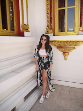
After planning my double page spread, I started to put it together. On the left hand side of the spread, the first thing to attract the reader is the main image of the featured artist. The model is staring straight into the camera and it is a close up shot. She is styled to look retro and unique, pulling a playful face. This will represent the genre of music she fits into which is electro/indie.
Beneath the image is a quotation from within the article. This will engage the reader as it in a bright box with crutial words highlighted. If the quote can gain the reader's attention, this will then prompt them to continue reading the article.
On the right hand side of the spread the main heading is simply the artists name. This gets straight to the point of the article so readers can identify who it is about straight away. Bright, eye-catching colours are used. The yellow on pink is playful but also reflects the fact it is a female artist stereotypically. Next to this on the left is a star with 'LCE LOVES' written in it. This gives the magazines 'approval' to the reader as this is a new artist featured, the magazine needs to prove that it worth while reading the article and getting to know the artist as well as giving the feeling that the magazine is first to give the audience the 'hottest' new artists/bands.
Beneath the heading is a simple, snappy sentence introducing the artist and briefly outlining the type of person the artist is. At the beginning of the article I decided to follow the typical convention of using a larger, bold letter at the beginning to establish exactly where the article starts. Following this is an introductory sentence in bold which on again, highlights the start of the article and attracts the eye.
I decided to run my article in the interview form as I thought this would be an easy way for an audience to get familiar with a new artist. It also is quick and easy to read and is a simple, un-cluttered layout. The questions asked by the writer of the article are in bold in comparison to the answers given by the artist. This allows the reader to clearly identify what is being said by who. There is a coloured line running down the middle of the article as to clearly indicate the column layout of the interview. The colour purple was chosen to purposely clash against the other colours and to highlight the exciting, bright personality of the artist.
There is another image included for more visual stimulation and make the artists face more recongnisable. At the bottom of the page is a box stating who will be featured on this page in the next issue. Similarly to the subscription box on the contents page, this allows the reader to assume they will purchase the next issue or subscribe to the magazine in order to find out what is said in the article of an artist/band they already fans of or it may trigger them to be intruiged to find out more about a new artist/band. I decided to include the colour scheme or red and yellow as that links to the previous pages of the magazine as it is the main colour scheme throughout this particular issue.

After completing my first draft, I noticed some things I could change to improve my double page spread. I was happy with the main layout but decided to firstly swap the images around. The motive for this change was throughout the interview, the artist is portrayed as outspoken and dramatic but aving an image where the artist appears more innocent contradicts this and allows the audience to get in touch with a quieter side to her. The smaller image is still showing a flicker of the 'madness' the audience recognise as to not confuse them or mis-lead them in anyway.
The next thing I decided to change was the colour sheme. Although the clashing colours in my first draft corresponded with the personality of the artist, now as I changed the focus of the images, I decided to go with a tranquil blue colour to reflect this purpose. Also it follows the rest of the colour scheme in the magazine of keeping it simple.
On the left hand side where the main image is, I decided to use a small box of text saying 'RADAR: HOT NEW ARTIST'. This makes the reader think they are exclusively being handed the insight into a brand new artist before anyone else and persuades them to read on so they get the news before anyone else. I also decided to include another quote and a box of 'need to know' facts about the reader so if a reader was to skim the page, they could briefly read bout the artist and it could also possibly prompt them into reading more. I decided to keep the red and yellow box on the bottom right hand side as I feel this works well in bringing the magazine together.
I am happy with my double page spread as I feel it appears proffesional, easy to follow and attractive to readers.
Subscribe to:
Comments (Atom)