
After analysing a double page spread, I made a rough plan of what I would include and how I would layout my double page spread.
I decided to include a large image on the left hand side of the spread. This will attract the reader and immediately introduce the featured artist/band. Beneath this I will include some text, possibly quotes or facts about the artist.
On the right hand side of the spread, on the top of the page will be the main heading introducing the artist. This will need to be bold and striking to make sure it draws the reader in. Beneath the heading I will layout my text in the typical convention of columns. This will make large amounts of text less daunting and easier to follow. On this page I will also include another image, again to split up vast amounts of text.
.bmp)
After planning my double page spread, I started to put it together. On the left hand side of the spread, the first thing to attract the reader is the main image of the featured artist. The model is staring straight into the camera and it is a close up shot. She is styled to look retro and unique, pulling a playful face. This will represent the genre of music she fits into which is electro/indie.
Beneath the image is a quotation from within the article. This will engage the reader as it in a bright box with crutial words highlighted. If the quote can gain the reader's attention, this will then prompt them to continue reading the article.
On the right hand side of the spread the main heading is simply the artists name. This gets straight to the point of the article so readers can identify who it is about straight away. Bright, eye-catching colours are used. The yellow on pink is playful but also reflects the fact it is a female artist stereotypically. Next to this on the left is a star with 'LCE LOVES' written in it. This gives the magazines 'approval' to the reader as this is a new artist featured, the magazine needs to prove that it worth while reading the article and getting to know the artist as well as giving the feeling that the magazine is first to give the audience the 'hottest' new artists/bands.
Beneath the heading is a simple, snappy sentence introducing the artist and briefly outlining the type of person the artist is. At the beginning of the article I decided to follow the typical convention of using a larger, bold letter at the beginning to establish exactly where the article starts. Following this is an introductory sentence in bold which on again, highlights the start of the article and attracts the eye.
I decided to run my article in the interview form as I thought this would be an easy way for an audience to get familiar with a new artist. It also is quick and easy to read and is a simple, un-cluttered layout. The questions asked by the writer of the article are in bold in comparison to the answers given by the artist. This allows the reader to clearly identify what is being said by who. There is a coloured line running down the middle of the article as to clearly indicate the column layout of the interview. The colour purple was chosen to purposely clash against the other colours and to highlight the exciting, bright personality of the artist.
There is another image included for more visual stimulation and make the artists face more recongnisable. At the bottom of the page is a box stating who will be featured on this page in the next issue. Similarly to the subscription box on the contents page, this allows the reader to assume they will purchase the next issue or subscribe to the magazine in order to find out what is said in the article of an artist/band they already fans of or it may trigger them to be intruiged to find out more about a new artist/band. I decided to include the colour scheme or red and yellow as that links to the previous pages of the magazine as it is the main colour scheme throughout this particular issue.

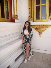
After completing my first draft, I noticed some things I could change to improve my double page spread. I was happy with the main layout but decided to firstly swap the images around. The motive for this change was throughout the interview, the artist is portrayed as outspoken and dramatic but aving an image where the artist appears more innocent contradicts this and allows the audience to get in touch with a quieter side to her. The smaller image is still showing a flicker of the 'madness' the audience recognise as to not confuse them or mis-lead them in anyway.
The next thing I decided to change was the colour sheme. Although the clashing colours in my first draft corresponded with the personality of the artist, now as I changed the focus of the images, I decided to go with a tranquil blue colour to reflect this purpose. Also it follows the rest of the colour scheme in the magazine of keeping it simple.
On the left hand side where the main image is, I decided to use a small box of text saying 'RADAR: HOT NEW ARTIST'. This makes the reader think they are exclusively being handed the insight into a brand new artist before anyone else and persuades them to read on so they get the news before anyone else. I also decided to include another quote and a box of 'need to know' facts about the reader so if a reader was to skim the page, they could briefly read bout the artist and it could also possibly prompt them into reading more. I decided to keep the red and yellow box on the bottom right hand side as I feel this works well in bringing the magazine together.
I am happy with my double page spread as I feel it appears proffesional, easy to follow and attractive to readers.
No comments:
Post a Comment